Raising a glass to reducing friction
Thursday, 4th July 2024
We explore how a series of small but mighty user experience changes help to improve the mobile experience for visitors to Local Wine School’s website, in our efforts to offer a smoother journey for visitors and improved metrics for the business.
From a single wine school in Newcastle, to over 40 locations across the UK, Local Wine School have enjoyed tremendous success in their two decades of trading. “Wine tasting is for everyone and the emphasis is on having fun" they say. Edward Robertson have been part of their expansion; supporting the onboarding of countless new schools to the franchise, and advancing the online offering with site features from account management to referral schemes, and professional-focused pages too.
Most recently, we were tasked with enabling visitors to reach their end goal faster, and with less fuss; whether that be to better understand what the business offered, select a wine-tasting event, or explore Wine & Spirit Education Trust (WSET) qualification.
We kicked things off with qualitative research; by listening to input of business leaders, before moving on to gathering quantitative data.
Tools like HotJar, which offers a visual heat map of the site allowed us to examine where users were spending their time on the page as well as the use of filters and depth of scroll, whilst analytics offered detail on the kinds of journey users took to reach an add-to-basket or outreach event.
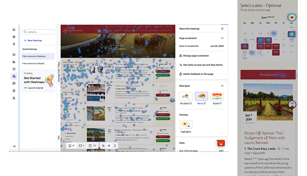
This insight led us focus our attention on several key site areas; the mobile navigation, Wine School homepage, 'All Events' listing page and the page template used for an individual Event, which shares the ins and outs of a wine tasting.
Less is more
Local Wine School offer a diverse number of wine-related events. From relaxed weekend evenings spent sampling wines and cheese, to professional qualifications, gift vouchers, wine tours and much more. Site users have the opportunity to browse the collection by date, by knowledge level, by location... all this to say, the homepage had become rather busy. We elected to try remove distractions, and offer 'less' in the effort to drive 'more' of a pleasant experience. Indeed, UX testing demonstrates that overly flashy advert-style content a prime content location on the homepage is often met with negative reactions from users (source: Baymard Institue).
.png)
Before (left) and after (right). By reducing the prominence of reviews, as well as verbose titles and newsletter promotions, we've landed on a more streamlined and refined homepage design.
Filter, Sort and Find
The site's All Events listings page is a hard-working spot on the site. Designed to allow users to filter the events available to them in order to find the right one, analytics showed a significant amount of time spent scrolling. We also noticed that whilst the visible refinement options on Desktop were being utilised, the mobile users weren't as supported. "When well-designed, [filters] create a positive feeling of control and choice, even in the face of overwhelming numbers of options" say Neilson Norman Group (source: Neilson Norman).
Thus, we introduced the option to filter further, sort results and refine the list with some simple audience based controls; the general public are serviced with a 'Hide Professional Events' option, and new priced-based sorting.
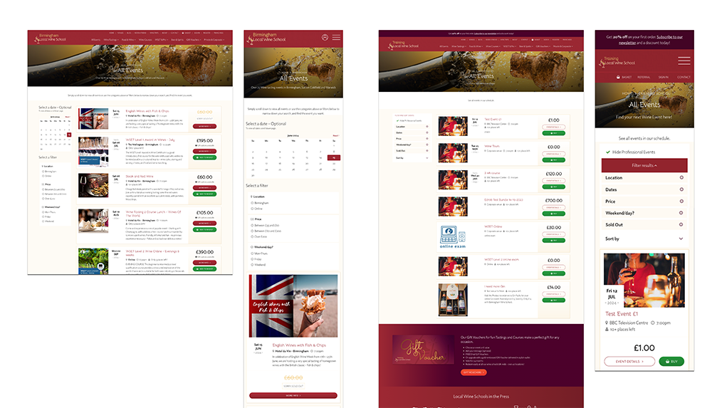
Before (left) and after (right). Now, visitors are greeted by a series of filters in place of verbose copy that help them get to a relevant event, sooner.
Elsewhere on the site, we rearranged a rather tricky mobile navigation structure that had previous withheld several key options - including the basket, sign in and venues links - from the main burger menu. Now, a single click offers all navigation options and several persistent links allow quick access to key action-based areas.
In the presentation of an event listing, we swapped length summary copy for a neat fact-and-figure based card layout, and re addressed the hierarchy of buttons.
Collectively, these changes look to help visitors discover, digest and decide on which of the wonderful wine events is right for them. We'll be looking back to HotJar for feedback on interactions as well as analytics for those journey lengths as the new pages serve visitors going forward.

