Expert website advice
Get monthly news & ideas. Unsubscribe at any time.

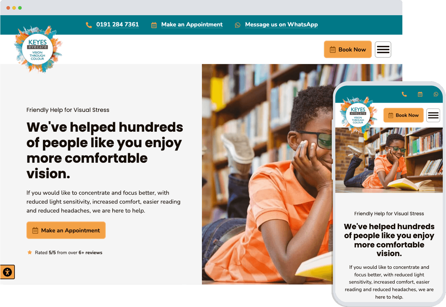
Vision Through Colour is a new website for an existing client who have helped hundreds of people who suffer from visual stress to enjoy more comfortable vision.
View Website
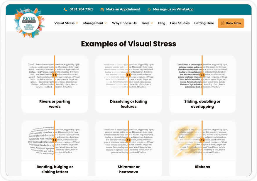
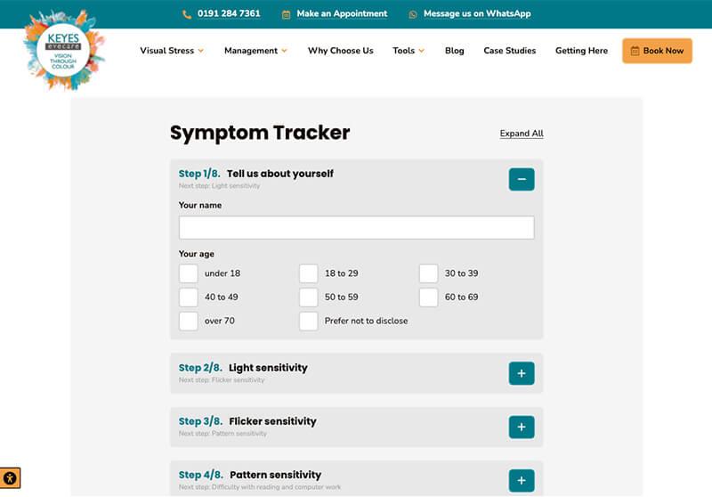
We created a visually stunning but beautifully simple website that makes it easy for people with visual stress to identify their symptoms and find a solution. Working closely with our client, we ensured that every design element—from the colour palettes to the navigation—reflected their brand's personality.
Built with accessibility in mind, we prioritised the user experience, ensuring visitors (who might be suffering from visual stress themselves) could easily explore and engage with the site content, while enjoying the site's aesthetic appeal.
The site was built with responsive web design techniques so that it performs seamlessly across devices. Accessibility and speed were top priorities, to provide an inclusive experience for all users. From the initial brainstorming sessions to the final deployment, we delivered a website that doesn't just look great but also serves as a powerful tool to connect with audiences and drive the business's goals forward.

The new Vision Through Colour website is a testimony of attention to thoughtful design here at Edward Robertson. The new website combines the use of neutral colours, colourful photographs and graphics, easy-to-use navigation, accessibility tools, and of course, useful tools to help users diagnose visual stress symptoms.

